Blog

Book Cover

I have an ambitious goal to complete my personal time project year end report by December 1.  I had a vision of a cover design for the report so I spent a little time sketching it out and refining it in Illustrator.  Below is the first digital pass.  I must say, I got pretty excited and happy with the design when I saw the vectors rendered on my monitor.

A-retrospective-analysis

Personal time analysis project

365log.blogspot.com

For the past 10 months I have been keeping (relatively) detailed records of time spent on my daily activities.  The initial goal was to try and figure out how to be more efficient with my time.  I anticipated tracking my time for a week; maybe two.  Well – ten months later and I am still going at it.  After about one month I decided I should just go for a full year and make a project out of the process.  I have recently created a blog – 365log.blogspot.com – to document the project and share the data with whomever might be interested.  Although the project is not a design project I intend to include design elements when I wrap up the first year.  Below is an example of a potential graphic I designed for the project:

total-year-graph

New Website, New Logo, New Business Cards

With a new website and a new logo, it was only appropriate to design new business cards.  My personal design aesthetic preference is clean and simple but I wanted to explore a variety of options before committing on a design.  I ended up creating 12 unique designs; below is the final four designs I debated between:

business-card-design

After making my final decision I did the only logical thing; I made a 3D CAD model to see what the final printed cards would look like… This also afforded me an opportunity to easily test the remaining designs and confirm my decision.  Below is my final decision in the 3D environment

business-cards-rendering


April 2, 2014

We don’t always get it right the first time…

sunglasses-temple-design

Fortunately, with 3D printing we can easily determine how a design can be improved before it is sent for tooling.  In this case, after the prototype was created and tested we determined the design would be improved if we removed 6mm from the length of the temples.  6mm might sound like a minimal amount to invest energy into; but it is usually a collection of small details that make a product great.  I am always happy to make a small change to make a big difference.

A 6mm change can sometimes mean a significant amount of work.  In this case, the change was simple but required a lot of work to maintain continuity between surfaces.  So, to improve the design, I spent my day pushing and pulling CVs.

alias-design-autodesk


March 29, 2014

Logo

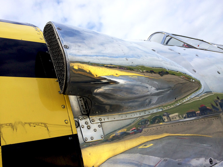
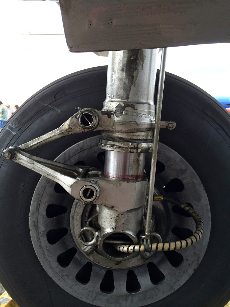
While I was creating this website and struggling with CSS and HTML and web hosting and … I still have no idea how this website functions…  I was quite proud after I had something functional so I showed the website off to a colleague who has also created a website for himself.  He was nice enough to inform me I “needed” a favicon.  ”A favicon?!” I asked, “What the hell is a favicon?”  For those of you who might be living on earth like me and not in cyberspace, a favicon is the tiny icon in the web address bar or on a tab in a web browser that identifies the brand.  Well, unfortunately, he was correct.  What kind of a legitimate website would not have a favicon?  So I scoured google for hours to learn out how to implement such a thing.

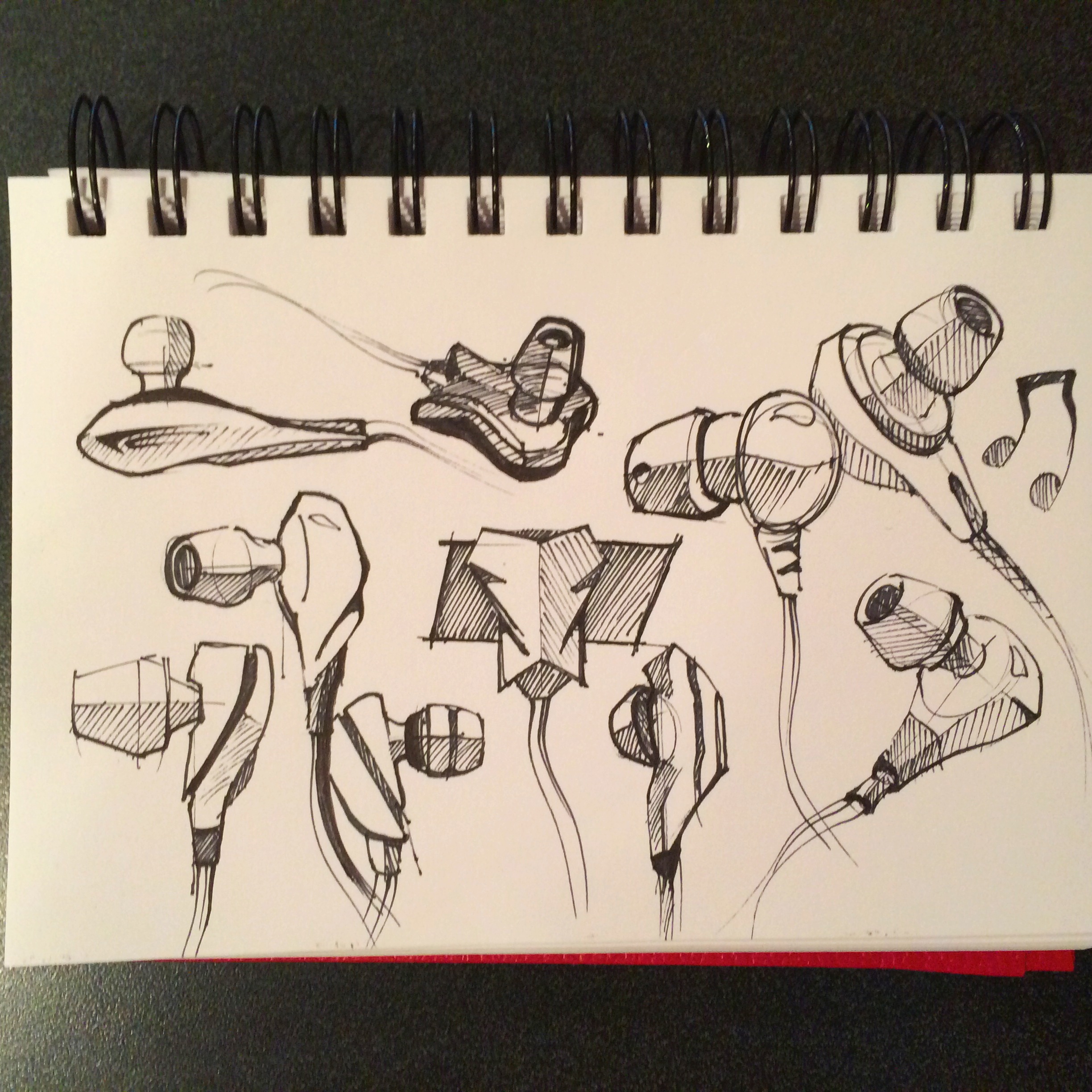
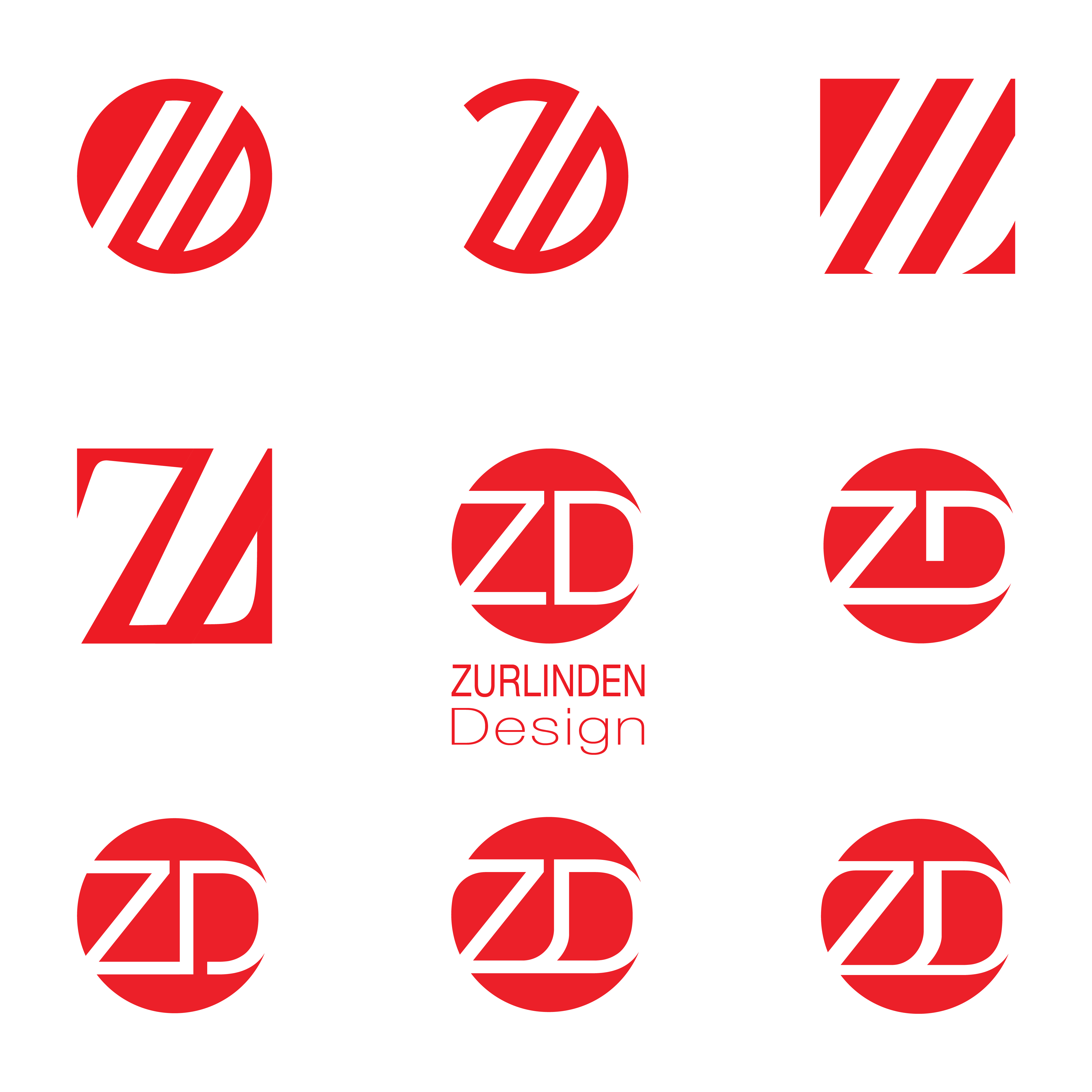
After determining adding a favicon was actually a feasible task, I realized I did not actually have an icon/logo to use as a favicon… Before losing my motivation I quickly opened Adobe Illustrator and whipped up this little guy:

Zurlinden Design Logo


The initial concept worked well for a placeholder until I had time to consider alternatives.  After many sketches and Illustrator revisions I have narrowed my favorites down to the nine below.  I determined I was actually quite fond of the red dot theme so I pursued that pretty heavily.  After all the variations I considered, my original “quick and dirty” logo made it to the final nine.  Sometimes the first idea is the best idea…  Some of the design directions below are abstract (which I rather like…) and some are more literal.  Anyway, if you look at your address bar or browser tab you will see the logo I chose to use.  Also, when you click on the button in your browser that says “add to favorites” the little favicon will hopefully appear in that list as well.  Assuming I did things correctly…

Zurlinden Design Logo Concepts


March 19, 2014

Welcome

Welcome to Zurlinden Design!  Today is the official launch of my new website.  This site is intended to be my online design portfolio.  The featured content is a sample of projects I have worked on either individually or collaboratively.  As a trained industrial designer, the bulk of my work is product design.  However, I occasionally have a graphic design or CAD project slip into the mix.  My goal for this site is for the projects pages to continually evolve as I complete design projects.  Initially, I had not intended to include this blog page.  I have a hard time updating my personal social media pages so I am unsure how this blog will evolve …  Anyway, I think this can be a fantastic opportunity to show process and progress during my design projects.  Thanks for stopping by my site and having a look.
 
February 27, 2014